Try typing
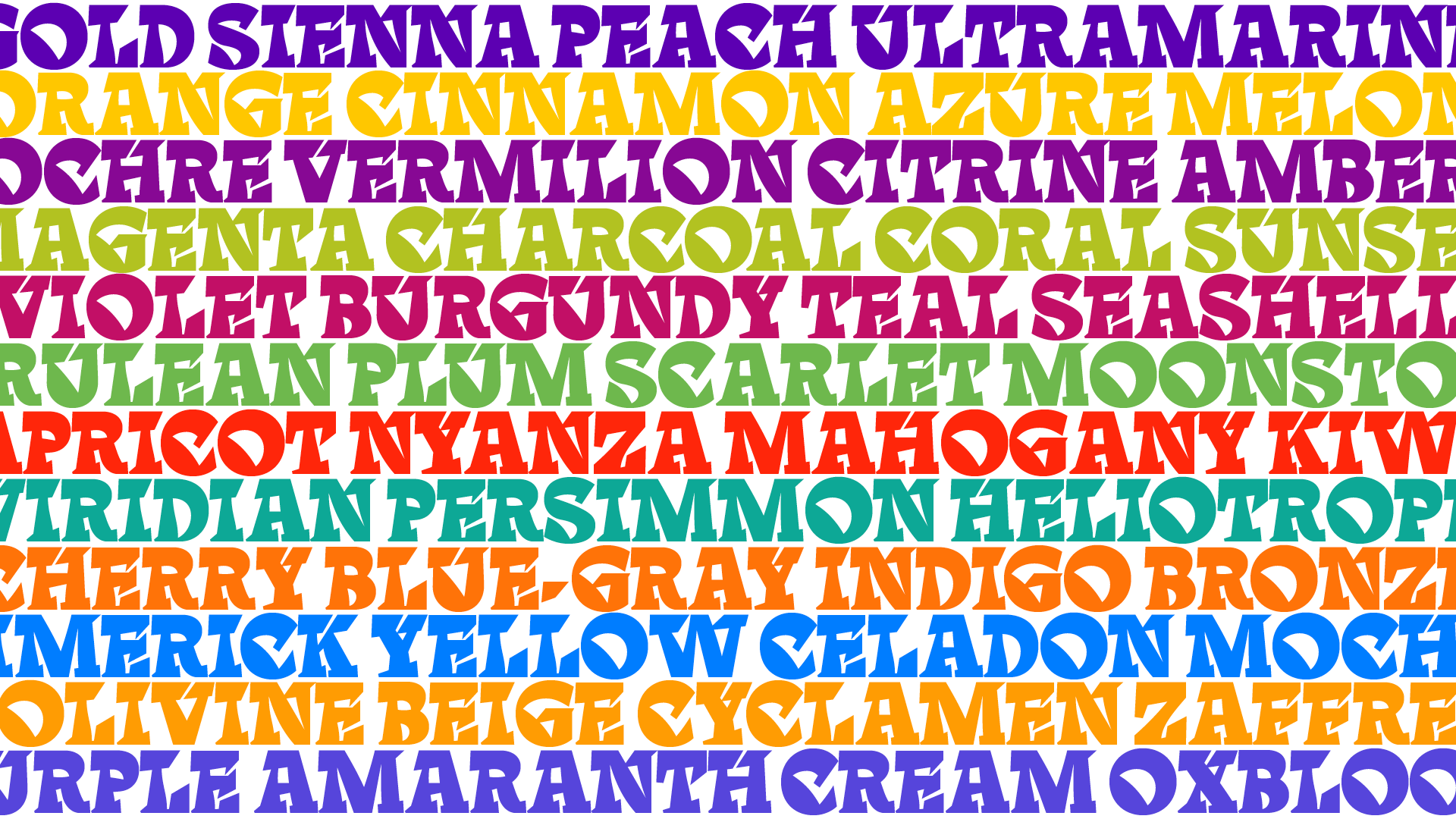
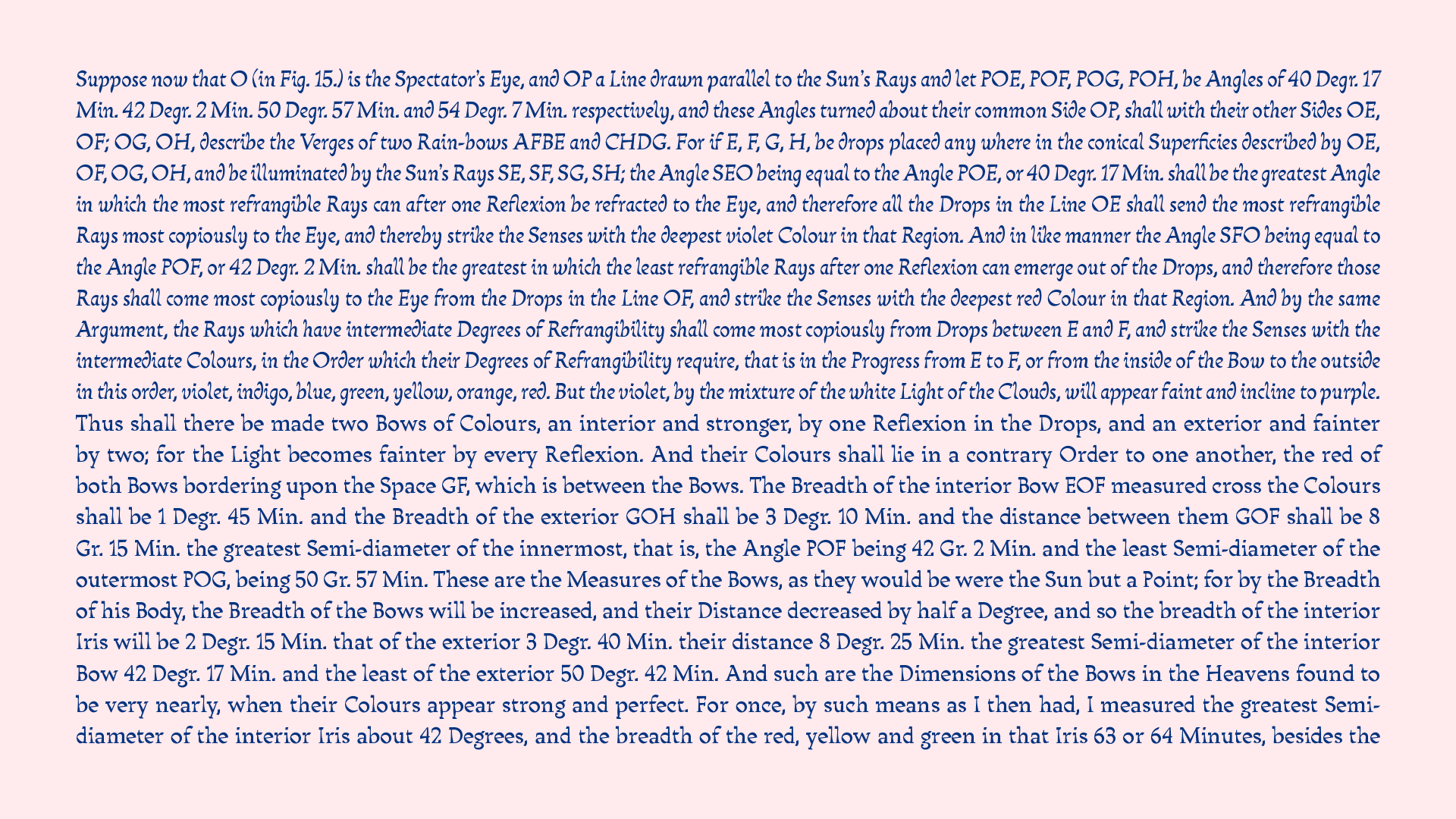
Think reverse contrast is weird? Try Rinca, the typeface with a curved contrast axis.
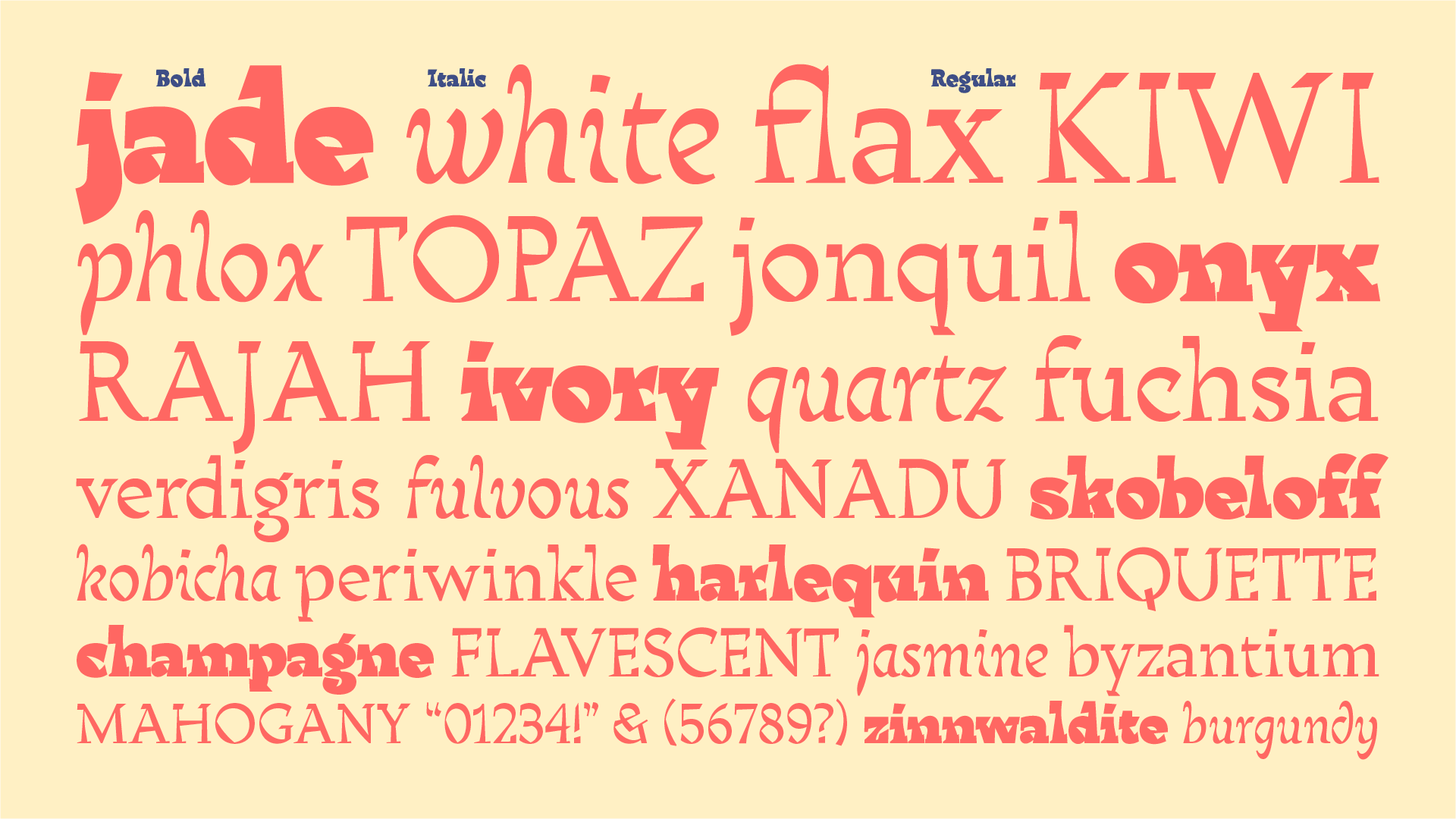
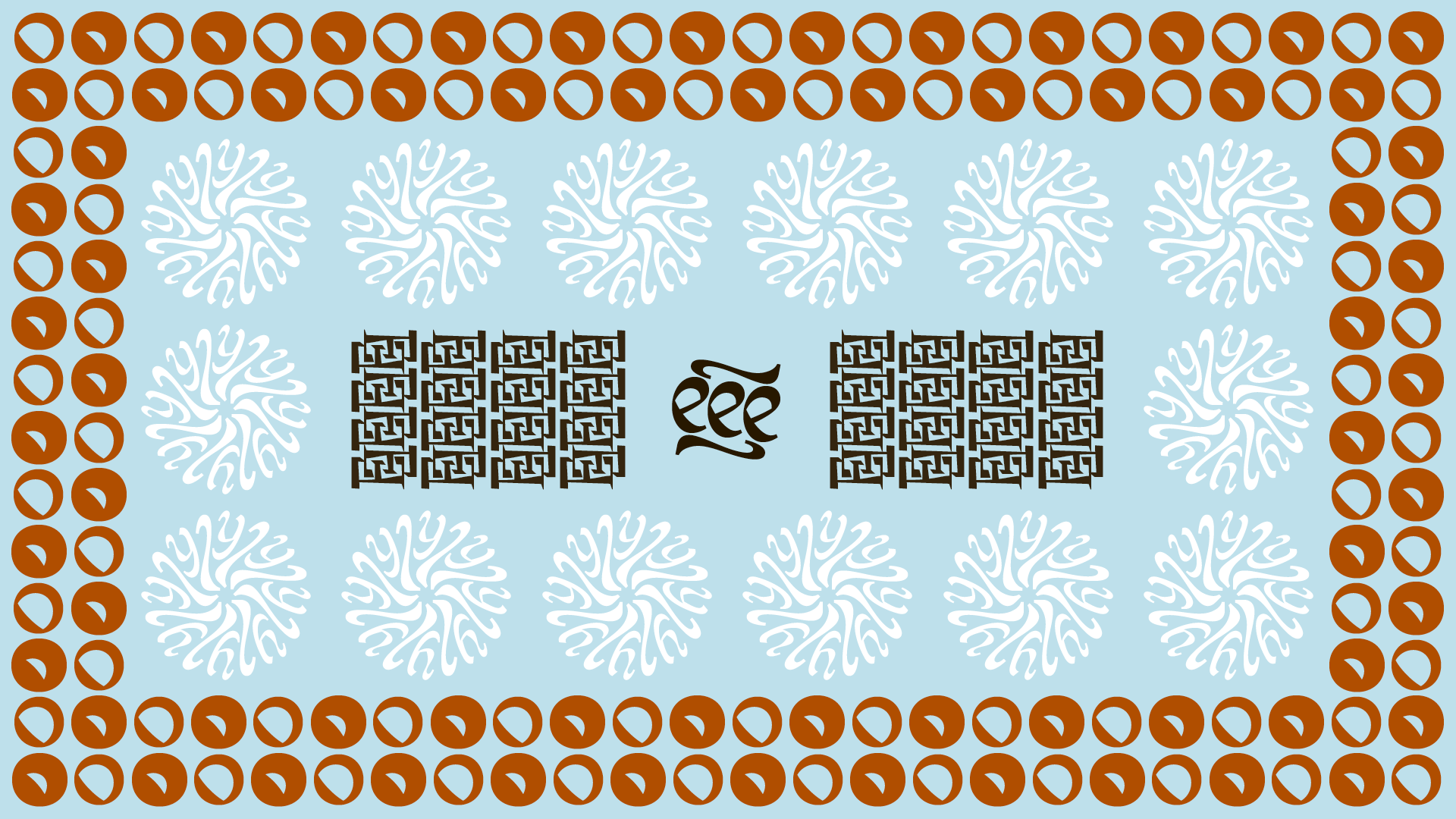
Rinca
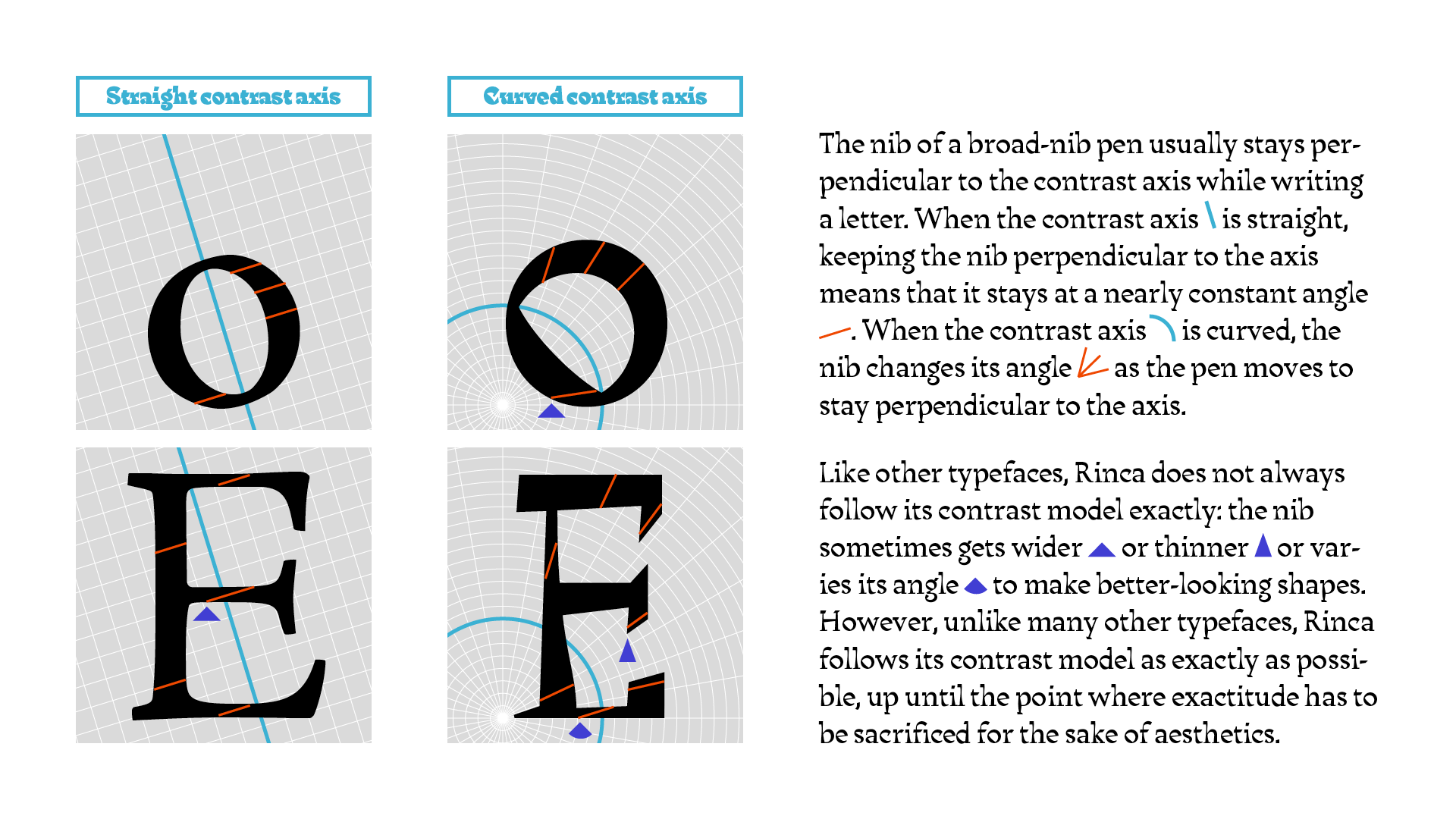
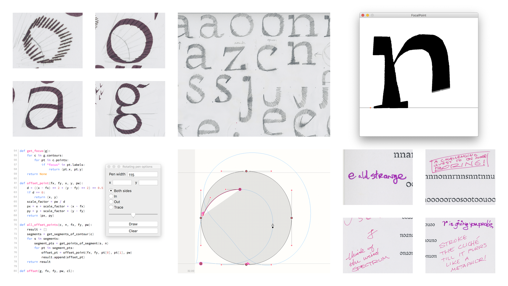
The contrast axis of a typeface is a line describing how weight is distributed in the letters. Strokes parallel to the axis are thick; strokes perpendicular to it are thin. Rinca is an exploration of what happens when the contrast axis is curved rather than straight. It is based on the shapes created by a broad-nib pen that changes angle as it draws based on its position relative to the arc of the axis. This creates a texture that is strange but self-consistent. Rinca is mainly intended for display use, but the regular style can also be used for text.